This February (2023), my dream game finally came to life – Hogwarts Legacy – years after I first held the very first Harry Potter book in my hands (circa 1999).
This game was one of the most anticipated releases of the year and has now officially broken an all-time Twitch record for being the most-watched single-player game, with a whopping 1.3 million concurrent viewers (Insider Gaming, 2023).
Naturally, great expectations were set after the first trailers of the game were released. In this Hogwarts Legacy UX review, we’ll analyse whether the game managed to meet those expectations, and keep the magic alive.
First Time User Experience
A place to call home…
First things first: Hogwarts is all about the feeling of belonging and accepting your weirdness with a little help from your friends. It’s a magical place to call home, but one that also has many dangers you need to keep an eye out for.
I have to admit that upon entering Hogwarts for the first time in the game, I felt emotional. The resemblance was impressive and everything looked beautiful and cosy, just as expected. That in itself is a first small success.
Details like, selecting your wand, an adventurous visit to Gringotts, the sky upon The Great Hall, the dormitories for each house, magic portraits, moving stairs and changing seasons enhanced the feeling of immersion.

However, Hogwarts isn’t only about the enchanted portraits and secret passages. As any social “place”, it’s about the people, interactions and randomness that bring it to life.
On the good side, the castle is full of opportunities to overhear hilarious and absurd conversations- that truly remind us of the book dialogues- and small details like the ghosts and students receiving howlers letters enhance immersion in the Harry Potter world.
Of course, after a while, this can feel a bit repetitive and therefore less immersive.
Character Development
“You Need Your Friends, Harry” -A.D.
Then what about the characters? A cornerstone in the success of the franchise was of course the amazingly well-crafted characters and character arcs. I know what you are thinking. It would be very unfair to expect the game to live up to the original characters.
What could beat that? Probably, nothing. But to make interesting characters, means to make them relatable and therefore with their quirks and weaknesses and interesting obstacles for them to overcome in order to evolve throughout a story.
Additionally, the role of storytelling and emotional attachment to characters are paramount in increasing one’s engagement in an activity.

The attempt to resemble some of the original characters, like Snape for example, kind of makes sense. You want us, the Potter-heads, to feel familiar and grounded, that’s great, we appreciate it.
But to me, the main heroes are mostly flat, and let’s admit it, no one wants a Snape who is mediocre bad, but has the same haircut. Although the main story is interesting enough, the dialogues between my friends and I are lacking emotion and seem very “official” in tone.
Friendship is a very important ingredient in the magic world of HP and as stated above, this doesn’t look good for the player’s engagement. However, on the bright side, the characters I met during side quests are quite interesting and diverse in many exciting ways.
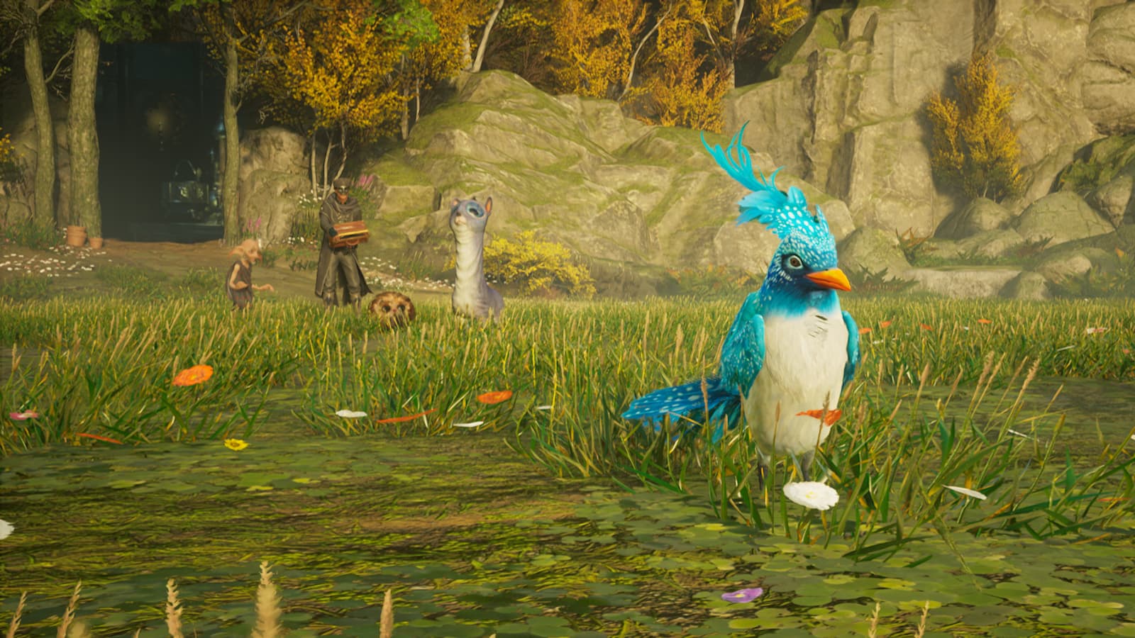
Like for example, Poppy Sweeting – a Hufflepuff student with deep knowledge and love for the Hogwarts Legacy beasts- who is an adventurous and empathetic spirit.
Map Design and Menu Navigation
“It is the unknown we fear” -A.D.
Well, yes, Dumbledore got it right as always. Now, let’s talk about the hippogriff in the room, the map. According to the Daily Prophet, the news is bad. Although the game features a lot of content and an astonishing environment, the Hogwarts map is not intuitive, at all.
I found it really confusing to understand the logic behind it, and the icons are sometimes so small -and therefore not particularly accessibility friendly- that it’s hard to click on specific areas (e.g. to fast travel). That is unnecessary friction for the player and as a famous UX Heuristic says “don’t make me think”…when there is no point or reward for it.
To help players understand the map, the developers included it in the carefully crafted tutorial, yet the Hogwarts map navigation pain points persist.
Even after playing over 40% of the game, I am still confused and clicking on the wrong things. It is quite surprising indeed for a game that made such a great effort to keep the experience intact by creating exceptional onboarding.
The map interrupts the player’s flow and is also hard to learn. What would have made a huge difference is using the Marauder’s Map from the books, and making it flat – a more simplistic approach-, or even offering two different views instead of only the 3D version.

In contrast, the onboarding successfully taught me the basic game mechanics at a very natural pace. They didn’t just squeeze all the information at the beginning of the game.
Instead, using the story narrative, they carefully spread it across the game. Considering the working memory and limited attentional resources of our brain, the creators successfully created a UX friendly and seamless onboarding.
The game familiarises the player with just the right amount of information they need at the right time and without breaking the experience, allowing you to fully immerse in the otherworldly environment of the game.
However, when it comes to the menus, it can feel like you’ve been casted with a confusion spell.
Where can I edit my gear appearance? What about the notifications in collections that stress me out? And why does the menu iconography sometimes feel like an ancient runes class?
A card-sorting exercise with live participants, would definitely help refine the menu navigation. Additionally, there should be an iteration on some of the UI elements and possibly the wording of categories. Overall, the menu and the map lack two crucial UX elements, discoverability and learnability.
Unsurprisingly, where there is unnecessary friction for the players, that is where unwanted negative feelings arise.
Game Mechanics
“To The Well-Organised Mind, Death Is But The Next Great Adventure” -A.D.
Let’s talk about the spells. First, the way the game teaches the player how to perform spells is really well crafted and imaginative. The player usually has to complete a quest and in the end, as a reward, the professors themselves teach you the spell.
To make this even better when you learn a curse, another relevant character teaches you the spell instead of a professor- that wouldn’t make any sense.
That is particularly good UX for two reasons. One, it doesn’t break the game’s narrative, but instead it enhances the immersion. Secondly, players feel satisfaction and achievement by becoming better at the game’s mechanics for a reason. This makes learning spells meaningful but also motivates the player to complete the quests, as it will increase their competence and experience points. According to Celia Hodent: “Being able to consider what will be meaningful to the players and when, is where all the challenge resides—in placing yourself in the players’ shoes.”
However when it comes to the Alohomora Spell, you have to repeat the process every time you want to unlock a door. This can be daunting for a player and breaks the experience for them.

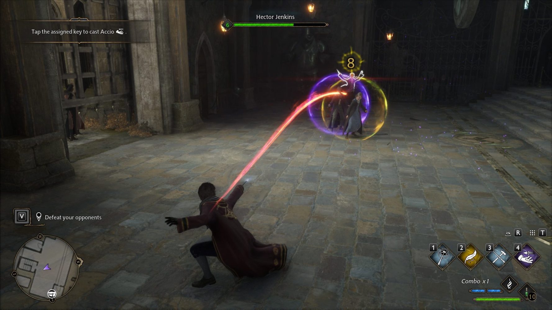
Fighting with your wand in Hogwarts Legacy feels amazing. Not only do the mechanics feel great, but there is also a wide variety of spells to choose from. The synergies between spells and the variety of combinations make battles feel like a curated, spontaneous experience with a cinematic touch.
Further, by providing players with the right amount of short-term objectives and space to personalise their fighting style, the game’s core loop remains engaging and grabs their attention for the long run.
Details That Add to the Experience
“Let us step into the night and pursue that flighty temptress, adventure” -A.D.
As we reach the end of this article, it is important to highlight two more key points. First, flying with your broom is an exceptional experience.
We must commend the developers for the jaw-dropping simulation and attention to detail. Notably, the way your character’s cape moves in the air as you fly and the realistic sound effects truly bring the experience to life. Don’t get me wrong, it is challenging in the beginning.
But here lies the game’s greatest success: a carefully -almost seamless- curated onboarding that gives a sense of purpose, value, and impact to the player, naturally entangled in the story narrative.
This way the player is motivated and their memory deeply processes the game mechanics. Players are thus able to experience flow as they literally learn how to fly in a flying class, similar to books and films.
That way it feels natural, and applying just the right amount of challenge makes the flying experience even more enjoyable. Plus, the game motivates the player to polish their flying skills through relevant side quests and objectives. On the other hand, not being able to play quidditch was a big disappointment.
Another great example of how the onboarding smoothly teaches the player, by using the Hogwarts elf N.P.C to introduce you to this new game feature. That keeps the experience intact and makes the process of introducing new game elements fun and more digestible. There’s a lot to take in so introducing everything at once would be surely overwhelming for the player’s memory and attention.
Overall, the creators have provided us with a remarkable experience that is both customisable and immersive.
Conclusion
In this Hogwarts Legacy UX review, we’ve covered how the game’s most critical issues are the navigation -primarily in the map and menus- and the one-dimensional characters with minimal complexity.
The game could benefit from simple actions that add immersion, such as more randomness and diversity in interactions between characters and objects, and possibly the ability to perform everyday actions like sitting or sleeping.
Although there are some bugs that you may encounter, the development team will likely fix these issues.
The creators certainly kept the fans in mind, but they have paid a lot attention to newcomers as well. It’s an excellent game that keeps players engaged – even loading times are almost nonexistent in the game(!) – with a wide variety of activities, progressively revealed surprises and astonishing attention to detail.
But what truly makes HL a great game is the good UX of it all: an almost flawless onboarding – that makes sure to keep the experience intact- along with very well crafted interactions and meaningful feedback for the users.
I hope you enjoyed my Hogwarts Legacy UX review. As I’m still playing and have a lot of enemies yet to defeat, I might have more to say in the future about the game. Until then…“I solemnly swear that I am up to no good.”
If you are currently working on a video game, check our services to help you at any stage of development.

Rating: 9/10


